

Views
A view is a saved way of looking at a database’s records. One dataset, many views — each with its own filters, sorts, and visible fields. Every database keeps at least one view.
View types
Section titled “View types”- Table — virtualized (fast on large databases), inline cell editing, multi-select for batch edits, and per-column widths. The default.
- Board (kanban) — group by a
selectfield and drag cards between columns. Column order follows the option order; dragging within a column reorders records. - Calendar — place records by a date field and drag to reschedule, in Month, Week, or Day mode — see below.
- Timeline — a Gantt-style bar per record along a date axis, with drag-to-reschedule and an optional planned-vs-actual overlay — see below.
Creating a view
Section titled “Creating a view”Picking a type is the whole action — there’s no name to type or confirm first. The view is
created immediately with an auto-generated name (Table, Table 2, … — collision-avoided
against the database’s existing view names) and sensible starting config for whatever that type
needs: a board groups by the database’s workflow field when it has one, calendar and timeline
default to the first date field. Rename it, or change its group-by or date field, afterward through
the view’s own existing controls — the same ones you’d use on a view that’s been around for months.
A type that can’t work yet — Board with no select/user/relation field to group by, Calendar or Timeline with no date field — shows disabled with the specific reason, rather than being hidden or silently creating a broken view.
Filters & sorts
Section titled “Filters & sorts”Each view stores a filter tree and a list of sorts. The filter model is shared verbatim with the records query API, so a view you build in the UI expresses exactly the same query you’d send from code or an agent:
{ "filters": { "and": [ { "field": "state", "op": "eq", "value": "<in-progress-option-id>" } ] }, "sorts": [ { "field": "due", "direction": "asc" } ]}References to deleted fields are dropped defensively at read time, so a view never breaks when schema changes.
Building a filter
Section titled “Building a filter”-
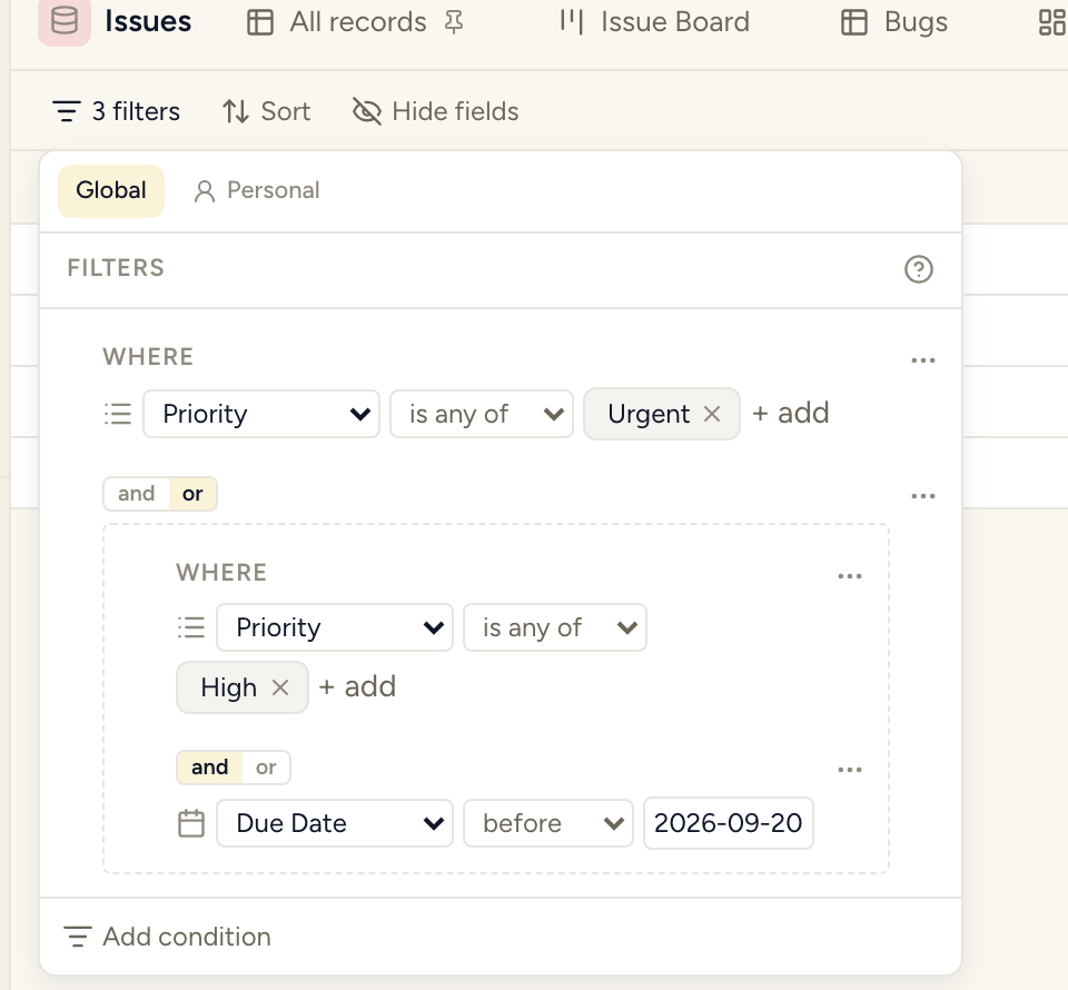
Nested And/Or groups — a condition can itself be a group, so “State is Urgent AND (Owner is me OR Owner is unset)” is one filter, not a workaround. Nesting goes 3 levels deep; past that, Turn into group on a condition’s own menu disables itself with the reason rather than letting you build something the server would reject.
-
Global and Personal render together, in one panel — a Global section (part of the saved view, same for everyone) and a Personal section (yours only, narrowing what Global already shows — ANDed in at query time, never a way to see past what Global excludes), both visible at once rather than switched between. The effective filter is always readable without toggling anything.
-
A dynamic “Me” value on any user field (including
created_by/updated_by) — pick Me instead of naming yourself, and the same shared view resolves to “assigned to whoever is looking” for every person who opens it, per-viewer, at the backend. -
Rich value pickers — select/multi-select/user fields get searchable, removable chips instead of a raw list; dates get the same calendar picker as everywhere else in the app, with Today and Clear.
Not built: per-database tabs for filtering across several databases at once. A view models exactly one database, and the filter format has no shape for “this condition applies only when browsing database B” — it isn’t a missing UI control, it’s an unmodelled case.
A condition’s own menu, and staying visible on the toolbar
Section titled “A condition’s own menu, and staying visible on the toolbar”Each condition’s ⋯ menu carries Duplicate, Pin to toolbar (or Unpin, once pinned), Edit name and icon, and Turn into group — plus Remove, set apart below a divider.
- Disabling a condition is its own persistent icon on the row, not a menu item — a disabled condition that looked identical to an enabled one used to be silently misleading (you’d read a filter that wasn’t the one actually applied), so its state has to be visible at a glance, not merely reachable by opening a menu.
- A filter with one or two conditions shows them as chips on the toolbar itself, automatically — small enough to read and tweak without opening the panel at all. Past that size, only conditions someone explicitly pinned show as toolbar chips; the rest live in the panel.
Operators
Section titled “Operators”Coverage is decided per field type and kept uniform — no type missing an operator its neighbour
has for no reason. Text (and url/email) fields get does not contain, alongside contains:
an unset field counts as “doesn’t contain X” rather than being silently excluded, the same way an
empty field already counts toward is_empty. The full type-by-type list is the operator × type
matrix — the same table the raw API and MCP tools use,
so what the panel offers and what a filter you write by hand can express never disagree.
Record ordering
Section titled “Record ordering”Manual order (table default and within-column kanban order) is stored as a fractional index per record — reordering touches only the moved record. Sorted views ignore manual order and use the sort instead.
The row number, the ID, and the default columns
Section titled “The row number, the ID, and the default columns”A table has two different numbers on the left, and they mean different things:
- The row number (in the narrow gutter at the far left) counts the rows in this view, as currently filtered and sorted — row 1 is whatever is on top. It changes when you filter or re-sort; it is not an identity. The gutter header shows the total number of records in the view, and stays on screen as you scroll.
- The ID is the record’s permanent number — “issue 759”, the number people say out loud and cite in other records. It does not change when you filter or sort. In a table it’s an ordinary ID column: frozen at the left, visible by default, and hideable from Hide fields like any other column.
On a list or feed view the ID isn’t a column; Hide fields (or the Cards picker) carries a Row gutter section with a Show ID in the row gutter switch instead. Board, calendar and gallery don’t draw it, so they have no such control.
A new table starts with a short, useful set of columns rather than every field: the ID, the title, and up to four others — status/select, person and relation fields first, then whatever else comes first. Rich text is never a table column (it isn’t offered in Hide fields at all), and the system dates (created / last edited) are offered but off by default. This only applies to a new view; an existing view keeps exactly the columns it had.
Row height (28, 32 or 40) is a control in the table toolbar and is saved on the view; the default is 32.
Nesting rows under their parent
Section titled “Nesting rows under their parent”A table can show a hierarchy in place. When a database has a self-referencing one-to-many relation — Tasks with a Parent task, Epics holding Stories — the table toolbar’s Nest by picker offers it; choose it and rows with children get an expand caret, and expanding one reveals its children indented beneath it, in the same table, without leaving the page. Flat turns it back off and restores the ordinary table exactly.
- Only the “parent” side is offered — the single-valued reference, identified by its structure, never by its name. A database can have more than one self-relation, and each shows up on its own.
- Any depth. Children can have children; the caret appears only on a row that actually has some.
- Children load when you open a parent, not all at once, so a large tree opens quickly. For the same reason Expand all opens every row currently known to have children — click again to open the level that just appeared.
- Your view’s filter and sort apply at every level — to the top-level rows and to each parent’s children. Top-level rows are the ones with no parent, so a child only appears under a parent that itself passes the filter.
- Which rows are expanded is remembered for the browser session, per view — it survives a reload but isn’t saved on the view for other people.
- Selection and arrow-key navigation move through the nested rows as one list.
Hiding columns
Section titled “Hiding columns”Hide fields in the view toolbar turns any column off — including Created at and Updated at. Every column a table draws can be hidden; there is no column you are stuck with.
The choice is part of the view, so it survives a reload and everyone looking at that view sees the same columns. Want them for yourself only? Make your own view.
Filtering, sorting and hiding from the column header
Section titled “Filtering, sorting and hiding from the column header”A table column’s own header menu carries filter and sort — not only the toolbar. Sort cycles ascending → descending → clear on repeated clicks. Drag the column header itself to reorder columns.
A filtered column shows a glyph on its own header, always visible rather than only on hover, because an active filter is state you need to see at a glance, not something to discover by hunting. Its menu carries Clear filter on this field, and Hide field — which writes the same hidden-fields list the toolbar’s Fields panel owns, so hiding a column from the header and from the toolbar can never disagree about which columns are actually hidden.
Field order: the grid and the record panel
Section titled “Field order: the grid and the record panel”A record’s properties panel starts out following the database order — drag a column in the grid and the panel follows.
You can also arrange the panel on its own, for when the order that reads well on a record is not the order that reads well as a table. Once you do, the panel stops following the grid, and it says so: a line appears reading “Arranged for records, so it no longer follows the database order”, with a Follow the database order link that puts it back.
Board columns
Section titled “Board columns”A board’s columns come from whatever it is grouped by, and two settings control them independently of how the cards inside are sorted.
Column order
Section titled “Column order”- Natural — the grouping source’s own order. For a select or a workflow that is the option order, which somebody chose deliberately, so it is usually what you want. For a person or a relation it is whatever order the API returned, which carries no intent at all.
- Alphabetical
- By count
Rearranging a board never rewrites the grouping field’s options. Column order belongs to the view, so your board cannot quietly change a schema that every other view reads.
Hiding empty columns
Section titled “Hiding empty columns”Hide empty groups drops columns with no cards. A board scrolls sideways, so empty columns push the real work off-screen.
The “no value” column has its own separate switch, and that is on purpose. “No Epic” is a different question from “an epic with no issues” — the ungrouped column is usually the triage pile, which makes it the most important one on the board. Sweeping it away along with the empty real groups would be the obvious implementation and the wrong one.
Board columns from a date field
Section titled “Board columns from a date field”Group a board by a date field instead of a select, and its columns become periods — week, month, quarter, or year, your choice. Dragging a card into a different column changes the record’s date to land back in that column — the difference between a static report and a roadmap you can actually reschedule by dragging.
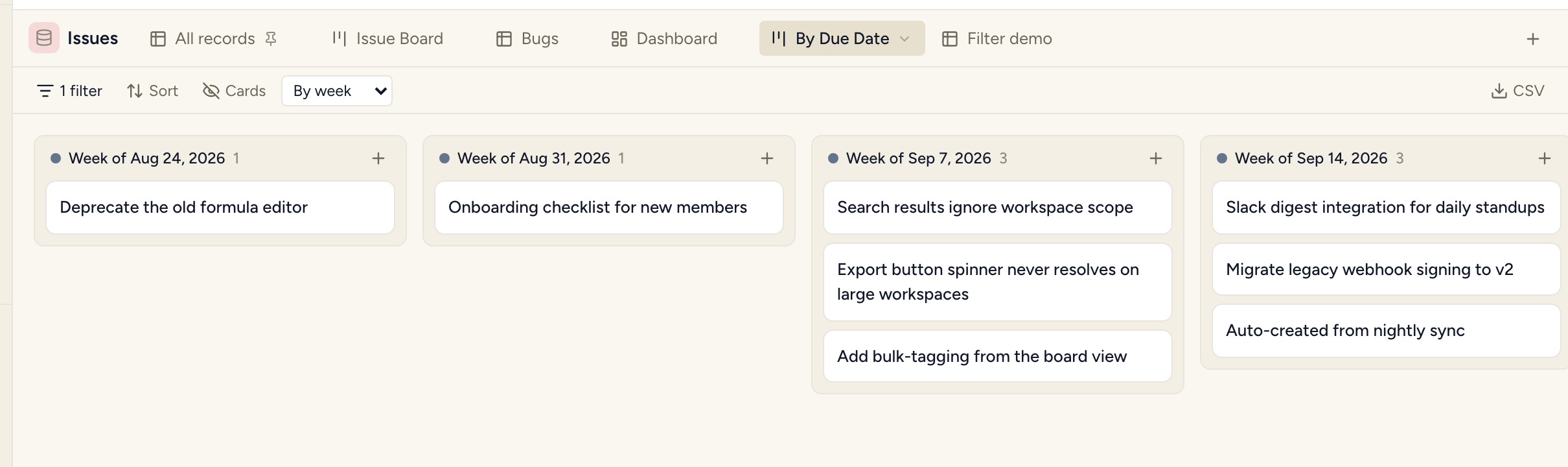
- Columns come from your data, not a fixed calendar range. Two records three years apart don’t produce three years of empty monthly columns between them.
- Dragging a card writes a date that re-buckets into the column you dropped it in — a card never jumps to a different column the instant you release it.
- Everything is computed in UTC, so two people in different timezones see the same card in the same column.
Board columns from a number field
Section titled “Board columns from a number field”A number field can group a board too, once it has bins — configure them from the field’s Edit
dialog (its ⋯ menu on the header). Each bin gets a label and an upper edge; bins are contiguous
by construction, not by validation — editing one bin’s edge is what sets the next bin’s floor,
so there’s no separate field to get out of sync and no gap or overlap to reject. The first bin is
always open at the bottom, the last always open at the top.
- Until bins are configured, the field can’t be picked as a group-by — the picker disables it with “configure bins on this field first, from its ⋯ menu” rather than silently omitting it.
- Columns render in bin order, by their label, not the raw numbers.
- Dropping a card into a bin’s column writes that bin’s own floor — the same rule a date-grouped board already uses for its bucket’s first day, so a card lands back in the column you dropped it in rather than bouncing to a neighbor.
- A record with no value, or a value outside every bin, gets its own placeholder column — the same “no value” shape every other group-by uses, not a second mechanism.
Board columns from text or a lookup
Section titled “Board columns from text or a lookup”A text or lookup field can group a board — one column per distinct value actually present in
your records, not a column for every value that could theoretically exist. Grouping by a rollup
or formula field isn’t offered yet.
These groupings are read-only: cards can’t be dragged to a different column at all. The drag never starts — it’s not that a drop is attempted and silently fails to save. There’s nothing to configure for this; it follows automatically from the field type, because a lookup or a formula’s value isn’t something you’d write by moving a card, and this project treats a computed value the same way whether it’s grouping a board or rendering a cell.
Changing what a board or list is grouped by
Section titled “Changing what a board or list is grouped by”A board or list view’s own tab menu (⋯ → Change grouping…) lets you switch its group-by field after the fact — you’re no longer stuck deleting and recreating the view to regroup it. The picker offers the same fields, in the same disabled-with-a-specific-reason shape, as choosing a group-by when you first create the view.
- Everything else about the view is preserved — column order, hidden-empty settings, card customization, filters. Regrouping changes one setting, not the whole view.
- Switching to or from a date field handles the week/month/quarter/year granularity correctly: choosing a date field offers it fresh, and switching away from one clears the old granularity rather than leaving it to resurface if you switch back to a date field later.
- A list’s grouping is optional; a board’s isn’t — a board always needs something to make columns from, so Save stays disabled until you pick one.
Sharing a view publicly
Section titled “Sharing a view publicly”A view can be published to a public, read-only URL — no sign-in required to view it — with an explicit allowlist of which fields travel. Nothing is exposed by default:
- Only the fields you name appear. A computed field (rollup, lookup, or formula) is included only when explicitly allowlisted — never automatically, even though it would otherwise render normally to a signed-in viewer.
- Related records don’t travel along by default. Sharing a view doesn’t hand out the data behind its relations just because a relation field happens to be on the allowlist.
- The link’s token is the only credential — the same posture as a public form. Anyone who has the link can view; nobody without it can guess their way in.
- A share can go further and become a portal: naming a recipient-scope field turns one open link into a per-client one, where every request must resolve to a real portal recipient and only that recipient’s rows come back. This isn’t in the Share… dialog yet — a direct API call, same as the recipient itself.
Tables, boards and dashboards can be shared. Share… is on the tab menu for those three; other view types don’t offer it.
- A shared board renders as columns, grouped by the same field as in the app, with the view’s
own column order and empty-group settings. The grouping field must be on the allowlist — publishing
is refused (
422, naming the field) if it isn’t, so a board can’t expose a column you didn’t name. - A shared dashboard shows its tiles, computed on the server. Each tile’s field, filter fields and database go through the same allowlist and are checked when you publish; a tile that points at another database is rejected. Charts and grouped tables are not published yet — the Share dialog says how many a dashboard has that won’t appear.
- A board’s column count is “N loaded” until everything has loaded. The public page loads in pages, so a bare number would understate; once the whole set is in, it’s a plain count. “Hide empty groups” likewise applies only after loading finishes, so a column that simply hasn’t filled yet isn’t mistaken for an empty one.
- If the owner later hides or deletes the grouping field, the board renders as one unlabelled column rather than failing; a dashboard drops just the affected tile.
- A tile with nothing to aggregate reads “—”, never 0 — a real zero is shown as a real zero. A tile’s comparison is plain text, not a link.
- Read-only, completely: no dragging, no per-column or per-tile menus, and no click-through from a card or tile — absent, not greyed out.
A personal view can never be published — not even by its own owner. Personal space’s whole premise is invisibility to everyone else, including admins; a public, anonymous URL is a categorically stronger exposure than “visible only to me,” so the server refuses outright rather than adding a second permission branch to get right and maintain forever. It refuses as a plain 404, the same way a personal view is already invisible to everyone but its owner everywhere else — the endpoint doesn’t confirm one exists at that id. Revoking an already-published link (Stop sharing) stays open regardless, since removing exposure is always safe.
Publishing one
Section titled “Publishing one”A table view’s ⋯ menu carries Share…, opening a dialog with:
- Visible columns — every field, checked by default except relations; a computed field (rollup, lookup, formula) is labelled (computed) and can still be checked, since exposing it is a decision you make, not something that happens by leaving it alone.
- Related records to include — off by default, one checkbox per relation field. A related record is its own data, not this view’s, so including it is a second, separate decision.
- Allow search engines to index this page — off by default.
Publish mints the link and flips the dialog to a Live badge with a copyable Link
(/v/{token}) and an Embed snippet (an <iframe> pointed at the same link with ?embed=1,
dropping the page’s outer chrome for a cleaner in-page embed). Editing the allowlist and publishing
again keeps the same token, so a link someone already has never breaks because you changed
which columns show.
Publish, reload, and reopen Share… and the dialog correctly reads Live with the working
link. (An earlier build of this feature had cleanViewConfig() stripping a view’s share config
back out on every read, so the dialog always reread “Not published” regardless of what publish had
actually done; fixed in #559.)
What a visitor sees
Section titled “What a visitor sees”A plain, unauthenticated page: the view’s name, the database’s name, a table of the allowlisted columns, and Load more if there’s another page. An unpublished or unrecognised token reads “This link doesn’t exist or is no longer public” — the same page a mistyped link produces, so a visitor can never tell “revoked” from “never existed.” That page answers a real HTTP 404, not a 200 with a “not found” message on it — the distinction a browser hides but a link-unfurling bot (Slack, iMessage, Twitter/X) reads directly.
Sharing the link itself previews correctly — the view’s actual name and database, not a
generic homepage title, and images resolve against your real domain rather than localhost.
Column headers and select cells render like the real thing. The public payload carries each
field’s actual display label (not a humanized api_name fallback) and, for select/multi_select/
workflow fields, the same coloured OptionChip a signed-in member sees — not a raw option id.
The “Powered by StoryOS” footer follows the workspace’s plan, the same computed value the public form page already used — visible on Free, hidden on a paid plan. No re-publishing needed; it reads live.
This is also reachable directly over the API (POST/DELETE .../views/{view}/share,
GET /public/views/{token}) and MCP (share_view, unshare_view).
Your own branding on the page
Section titled “Your own branding on the page”A logo and an accent colour — set once per workspace, from Settings → General’s “Portal
branding” section (or update_workspace’s portal_logo_url/portal_accent_color over MCP) — show
on every published view’s public page, on every plan including Free. This is a different,
non-plan-gated thing from the “Powered by StoryOS” footer above: your logo is your own brand
appearing where a client looks; our footer is our own attribution, which only a paid plan removes.
Nothing here is scoped per-view — one workspace, one logo, one accent colour, on every public view
link you share. (A public form carries the same footer toggle, but not
this operator branding — it’s the shared-view page’s own thing today.)
- The logo renders at the top of the page; the accent colour tints the page’s header border and a couple of small UI accents. Neither is required — an unbranded page renders exactly as before.
- Both are treated as data, never markup.
logo_urlmust behttps://(neverdata:,javascript:, or a relative path) and only ever reaches the page as an<img src>;accent_colormust match a strict 6-digit hex (#3366ff) and only ever reaches the page as an inlinestyle, never interpolated into a stylesheet or raw HTML. - Setting one field never clears the other. Sending only an accent colour leaves an
already-set logo alone, and vice versa — the same partial-merge convention the workspace
descriptionfield already follows. Sendnullfor a field to clear just that one.
Calendar: day, week, and month modes
Section titled “Calendar: day, week, and month modes”A toolbar toggle switches a Calendar between Month, Week, and Day — the choice is saved on the view, not per session, so reopening it later shows the same mode you left it in.
- Month is the original grid: chips on days, drag to reschedule at day granularity.
- Week and Day render an hour axis instead — a scrollable 24-hour column per visible day, with each record placed at its date field’s time.
- An optional second date field gives an event its real height — pick an End date field from the toolbar (only offered in Week/Day mode) and an event’s block spans start to end. Leave it unset and every event just gets a fixed, display-only block; nothing about the stored value changes either way.
- Two events overlapping on the same day both render, side by side — neither hides the other.
- A record with a date but no time renders in a separate “All day” row above the hour grid, in every mode, rather than vanishing from Week/Day because it has nothing to place on the axis.
- Dragging in Week/Day moves both the day AND the time (snapped to 15-minute steps); dragging the same record in Month mode still only ever changes its date, at day granularity — Month dragging doesn’t acquire a time component just because the calendar now has one. With an End date field set, dragging shifts start and end by the same amount, so a block keeps its length when it moves.
- An event that spans several days draws on every day it covers — the real start time on the first day, a full-height block on the days between, and the real end time on the last. (This needs an End date field to know where it ends.)
- The drag step is configurable — 10, 15, 30 or 60 minutes, from a selector in the calendar’s header row in Week/Day mode. It sets the snap when you drag an event and the time a click on an empty slot creates a record at; 15 is the default, so a view feels the same until you change it. The choice is saved on the view.
- Hours you don’t use can be collapsed. Tick Collapse hours (next to it) and pick a start and end hour, and the axis shows only that window. This hides hours, never records — an event outside the window simply isn’t on screen — and the All day row is never affected.
- Every mode paints a record’s colour (from the view’s Color by field) through the same shared colour source every other view reads, so switching modes never changes how a record looks.
Choosing the date field
Section titled “Choosing the date field”The date picker lists every date-capable field. Created at and Updated at are shown but disabled, with the reason beside them (“set automatically, so cards can’t be moved”), because a calendar built on one can be read but not rescheduled. A new Calendar view starts on the first editable date field; a database with none says “This database has no editable date field. Add a date field to schedule records here.” instead of offering a dead calendar. The Today button is disabled while the view already shows today.
Gallery: covers
Section titled “Gallery: covers”A gallery card’s cover comes from one field you choose in the Cover control:
- An attachment field — the record’s uploaded image.
- A URL or text field holding an
httporhttpsaddress. Anything else is never loaded. A card whose image fails to load falls back to the no-cover card for that card alone.
A database with no field that can be a cover says so in the Cover control’s place rather than hiding it, and a cover field that’s mostly empty says how many records have one (“Cover: Photo — 3 of 40 records have one”). The cover’s alt text is the record’s title.
Timeline: planned vs actual dates
Section titled “Timeline: planned vs actual dates”A Timeline picks a Start (and optionally an End) date field — the primary pair every bar is drawn from, draggable to reschedule. Beside it, an optional Planned pair (a second start/end date field) overlays a baseline on the same row: the primary bar solid, the baseline dashed behind it, so a planned-vs-actual gap is visible without a second view.
- Dragging only ever moves the primary bar. The baseline stays exactly where it was — there’s no drag target on it — so rescheduling a task never quietly erases what was originally planned.
- Slippage renders as a label next to the bar — “3d late”, “2d early”, or “on time” when the primary and baseline ends match. No baseline configured, or the record is missing one side of either pair, and no slippage label appears at all — a partial comparison is never rendered as a number.
- Undated records are counted, not drawn. A notice such as “77 records without a Due date are hidden” gives the real number across the whole database, not just the records loaded so far. A record counts as undated when neither its start nor its baseline start is set.
- A record can have either pair without the other. Primary-only draws its usual plain bar. Baseline-only — real actual/completion dates with no plan ever set for them — draws its own bar too, in the same solid style, positioned at the baseline dates; it is not left out, and not drawn as a dashed-only sliver as if it were half a comparison.
- The “N records have no date” count only means neither pair. A record rendered from its baseline alone is dated data, not a gap, so it never counts toward that footer.
- The date axis widens to fit baseline spans too, so a planned range that runs outside every actual date still has room on screen rather than rendering off the edge with no hint it exists.
Inline summary widgets
Section titled “Inline summary widgets”A table, board, gallery, or list view can carry its own strip of stat/bar/line/pie widgets above the records — a quick count or sum, or a small chart, without leaving the view or building a dashboard.
- A widget always matches the rows below it. Unlike a dashboard tile or widget, a summary widget has no filter and no database of its own — it’s an aggregate over exactly this view’s own (and personal) filter, computed server-side. Change the view’s filter and every widget updates with it; there is no way for one to drift out of sync with the grid underneath it.
- Stat shows one number: Count, or Sum / Average / Min / Max of a number field. Bar, line, and pie additionally group by a field, one bucket per aggregate call.
- Grouping is restricted to select, workflow, and checkbox fields — their bucket set is small and known up front (options, or Checked/Unchecked), so each bucket is one aggregate call rather than fetching every row to group client-side. Grouping by a multi-select or a date isn’t available yet — a multi-select record can land in more than one bucket, and a date needs a bucketing rule (day? month? quarter?); both are real, bigger features, not oversights.
- Add widget is in the view toolbar, next to Filter / Sort / Hide fields — not in the strip. A view with no widgets has no strip at all (no empty row or border); the strip appears when you add the first one.
- Each widget has Configure, Duplicate and Remove. Duplicate puts the copy directly after the original and opens its settings at once, because the intended use is “duplicate, then change the grouping” — Count by Priority beside Count by State is the fastest way to compare two cuts.
- Reorder by dragging; the order you leave them in is what everyone who opens the view sees, since it’s saved on the view like its filters and sorts — not a per-viewer preference. A single widget keeps its natural width rather than stretching across the row.
- Not offered on calendar, timeline, feed, or form views — there’s no row grid there for a widget to summarise (a dashboard’s own tiles/widgets already cover that shape).
- No dedicated MCP tool yet.
create_view/update_viewdon’t expose asummary_widgetsparameter — set it through a rawPATCH .../views/{view}withconfig.summary_widgets, the same general config field the web app itself writes to.
An empty view versus a broken one
Section titled “An empty view versus a broken one”If a view cannot load its records it says so, with an error and a retry. It does not render as an empty table.
This distinction is worth knowing because the failure it replaced was silent: a rejected filter, a deleted field, a saved view that stopped validating after a schema change, or the API being briefly down all used to produce the same screen as a database with nothing in it. “No records” read as “all my data is gone.”
So: an empty view means nothing matched. If something went wrong, you will be told.